
Camp Consulter
Campus Consulter’s website is a registration service that provides users with the ability to purchase camp services for their children from a comprehensive list of camps and equipment in a wide range of disciplines. Users can search for camps based on their personal criteria with the knowledge that they can find their ideal camp and easily book with no booking fee associated.
Project Overview
Challenge
-
Camp Consultant’s website has no defined hierarchy within content and lacks clear calls to action (CTAs) for users to navigate to and lead to customer conversion.
-
Within the website, there are no efficient search filters with a range of options and a functional mapping system to aid in user experience.
-
The website does not distinguish between portals for camp partners and parents/campers which impedes upon the website's ability to retain paying members.
Solution
-
Design a simple, clean, clear website that provides a user-friendly experience and helps users find information efficiently for quick conversion.
-
Facilitating ease of use with site layout and information architecture
-
Easily help users (camp owners) register as partners (profit model: commissions)
-
Redesigning a sophisticated filtering and searching system will facilitate the user to find their ideal camp or product with minimal effort.
-
More Call to Actions (CTA) is also needed to make more conversion.
Role
UX Designer and Researcher
Time
3 Months
Service
UX Design
UX Research
Content Writer
Tools
Invision
Whimsical
Qualtrics
Xtensio
Miro
Photoshop
Adobe XD
Research
Understanding the gap between Camp Consulter and it's customers.
Research Goals
-
Identify what motivates customers to find camps online vs word of mouth
-
Discover pain points customers encounter when looking for camps online
-
Determine what factors into a great online search and shopping experience
-
Identify Camp Consulter's competitors and evaluate strengths and weaknesses
Competitive Analysis
Analyzed Camp Consulter's competitors to see what their strengths and weaknesses were. This analysis allowed for a better understanding of the different approaches that the brands took in order to address a similar problem. This information was applied to help make the best decisions for Camp Consulter's product.
KidsCamps.com is a comprehensive directory of children’s camps in the US and Canada. Camp types include summer camps, day camps, overnight camps, and a wide variety of specialty camps. The site also provides a marketplace for camp jobs and camp sites for sale.
-
Includes camps outside of the US.
-
Provides link to official camp website
-
Content includes a wide variety of camp types including those design especially for special needs and military.
-
Homepage contains too much content, links, as well as too many CTAs.
-
Advertisements include camps not just companies that may provide camping equipment.
-
Reservation services also allow for the ability to rent camp locations for conferences and events.
-
Listings on camp related jobs which allows for another possible stakeholder, could improve search engine results and may be able to add additional source income from partners for job listings
Fessenden Summer fessendensummercamps.org
The Fessenden School (A Boarding and Day School for Boys, Pre-K – 9) provides summer camp programs called Fessenden Summer. Fessenden Summer camps include day, sports and speciality camps for girls and boys from age 3.5 to Grade 10.
-
Navigation is organized.
-
Homepage has clear categories of camp.
-
Has a calendar to show all camps’ schedules.
-
Has a page to list all kinds of camps’ date and rate.
-
Has customer reviews which displays trustworthiness
-
Full description of all camp features and activities for clearer understanding.
Ecole Francaise Greater Boston (EFGB)
The Ecole Francaise Greater Boston (EFGB) is a non-profit organization that offers high-quality and engaging early childhood education in French specifically designed for francophone families in the Boston area to help foster a bilingual identity. EFGB offers a french immersion summer camp that fosters social and language development through fun project based activities.
-
Homepage has a clear structure: introduction, camps offered, why EFGB, customer review, and blog.
-
A short and powerful slogan and big numbers to show their strength in the introduction part.
-
Hover effect on the camps’ pictures provides more information but also keeps clean and simple.
-
Clear navigation, especially the ‘After school’ and ‘Summer Camp’.
-
The location page seperate maps for different schools which helps users filter and makes the location information more unified.
-
The ‘Educational Program’ page under ‘After-school’ uses tabs to show program level which reduces effort to scroll up and down to see the information.
Persona
Drawing from a comprehensive grasp of user goals, needs, motivations, and frustrations, two distinct user personas were meticulously crafted, derived from insights gleaned through rigorous research. The first persona, Katherine, embodies the perspective of a parent seeking a suitable camp, while the second persona, Lucas, represents the perspective of camps collaborating with Camp Consulter to feature their information on the site. The entire design process was thoughtfully tailored to cater to the unique needs and experiences of these personas.


User Storymap
Formulating a dynamic framework, the user story map systematically delineated the anticipated customer journey, illuminating the multifaceted ways in which individuals engage with Camp Consulter. This camp database serves as a conduit for camp establishments to furnish pertinent information, enabling parents to seamlessly discover and register for camps through an intricately designed filter system tailored to their preferences. The analytical application of a user story map facilitated a granular understanding of the user's interaction with Camp Consulter, enhancing the strategic alignment of features and functionalities to optimize user experience.

Sketches
Crafted varied conceptual sketches for the Camp Consulter's website layout, meticulously aligning them with the identified personas. These designs strategically addressed the website's challenges, such as the absence of a defined content hierarchy and clear calls to action (CTAs), by envisioning a simple, clean, and user-friendly interface. The proposed solutions included optimizing the site layout and information architecture to enhance usability, implementing a streamlined registration process for camp owners to become partners and generate commissions, and redesigning a sophisticated filtering and searching system to effortlessly connect users with their ideal camps or products. The refined designs also emphasized the integration of strategic CTAs, aiming to boost user engagement and conversion rates on the platform.


Wireframes


User Testing
About this research
The purpose of this test is to find out if the new design improves the user experience. We will do this by placing key emphasis on the users’ ability to navigate through the website, find products through the new camp filters, register/checkout, use the site as intended by the design, and the overall ease of use. The outcome will help us make further user experience improvements to the website.
Logistics
-
5 participants were recruited by researchers.
-
Interviews were conducted in person as well as over video conferences by a dedicated moderator.
-
4 participants were given parent/guardian testing scenarios while 2 were given camp partner scenarios. All participants were family/friends of the researchers.
Research Objectives
The objective of this study is to understand how people use and get value from the Camp Consulter website:
-
What’s your overall impression of the website?
-
Do you find navigating between pages easy or hard?
-
Do buttons direct you to expect pages as it is labeled?
-
If you get a chance, how would you improve this site?
-
Is there anything you want to share with us that we didn’t cover today?
Key Findings
01
Information on Camp Partner Page is not sufficient
The Camp Partner Page currently lacks comprehensive and transparent information, specifically concerning financial aspects, posing a potential obstacle to user retention. Users have articulated concerns regarding the opacity of fees associated with camper registration and the percentage allotted to Camp Consulter, both on the Camp Partner page and within the registration form. This ambiguity has been highlighted through user feedback, with explicit mentions of confusion regarding the purpose of requesting bank account and routing numbers instead of credit card information during monetary transactions.
Analyzing user comments such as, "I don’t see clear terms saying how to split profit with your website" and "What is the bank account and routing number for. Can’t I just use my debit card," underscores a critical need for enhanced clarity and transparency in financial dealings. The potential consequences of this lack of transparency are substantial, as users may be inclined to leave the Camp Consulter site, deterred by the uncertainty surrounding monetary transactions.
To address this, a strategic approach involves augmenting information on the Camp Partner Page, extending beyond the mere mention of membership costs. Specifically, incorporating explicit details on fees associated with camper registrations, coupled with the percentage allocated to Camp Consulter, can instill confidence and persuade potential camp partners to consider membership. Furthermore, integrating this financial information directly into the registration form ensures that users are not required to search for crucial details, fostering a sense of trust and transparency. In essence, this analytical perspective underscores the pivotal role of transparent financial communication in user retention and the cultivation of trust on the Camp Consulter platform.
02
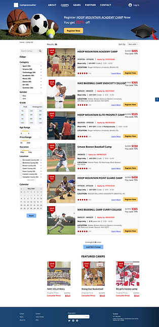
Search bar on Camp List page should be more specific
The search bar is an important aspect of a user searching for content on Camp Consulter website. Users felt that although the header search box was easily understandable, the addition of text within the search bar for the Camp List page confused users as to its purpose if the text does not accurately explain itself. Also, the search box on this page did not attract enough attention to be useful.
-
“What is this search bar (in camp list page) for? What kind of keywords can I input? Maybe give some instructions below? I don’t understand what this search bar is for? It’s a little vague. I know it’s a search bar but what kind of keyword can I input? Home page search bar is good, looks like this is good.” – #1
-
“Did not noticed search bar” - #2
What this means:
Search bar content should be changed to help aid users in usability and visibility. The search bar may also need to be adjusted by size, color or other to aid in visibility. The use of the phrase “enter a keyword” may need to be changed to something more appropriate or eliminated altogether. “Keyword” can be changed to “camp name”. This way users will know on the Camp Detail page that they have the ability to enter the full or partial camp name without having to go through the filter process to find a camp they are already interested in viewing. This would aid in fixing the usability of the search bar.
03
The information on the Homepage should be more concise
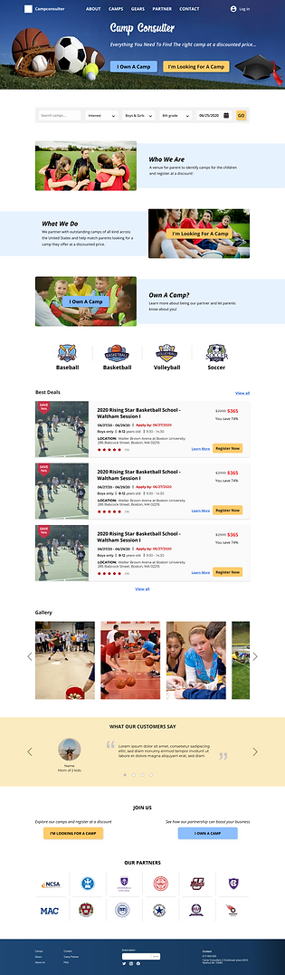
The information on the homepage has been considered overwhelming. The search bar, the buttons on the introduction, the category icons, and the gallery are too close to make participants feel that someone urges them to make an action.
-
“There are too many buttons or indicators speaking to me to go to the camp list page. Just give me one, an efficient one is enough.” - #4
-
“The picture under the buttons make this part not clear and simple. I didn’t even see the text on the buttons because there was too much stuff. “ - #4
What this mean:
Users may not stay to obtain the information or see necessary CTAs. Adding more space between sections and possibly moving the gallery under the deals section to diffuse the density of the similar information may help ease of use.
04
Visual navigation on camp list page need to be improved
The purpose of the hero image is vague. The tester can hardly tell what information is conveyed in that area. The image is the same as the homepage, the discount percent is not standing out, the title is also not eye-catching. Testees were trying to click the image and title area of each camp. That’s a habit that most users have. We need to make it visible that that area is clickable.
-
“The whole hero area on this page is not inviting.” – #1
-
“I didn’t realize the header is an advertisement. What I saw first was the button and I was confused by it. Like register what?” - #4
-
“There should be more places I can click .” – #3
What this means:
The hero image is one of the main areas that will entice users to continue to explore other pages as well as can serve as an important area for CTAs. The hero image could be changed to something more attractive. Also, the hero image should be formatted in a way that the user knows its purpose on the site.
Final Design
Main Pages


Log into account


Sign up as a Camp Partner


Sign up as a Camper


